Data Tips
Organising your Analysis Project
A key step for a successful analysis is to start with a tidy directory structure. This ensures that you can keep track of what each file is and can avoid many headaches when analysis gets more complex.
Here’s some practical suggestions:
- Early in your project create a few sub-directories such as
scripts,data/raw,data/processed,figuresand any others that might be relevant for your specific work.- To ensure reproducibility, save your code in scripts and define file paths relative to your project’s folder.
- Keep your raw data separate from processed data, so that you can go back to it if needed.
- In RStudio specifically, you can create an “R Project” within your project’s folder (File > New Project...). This will ensure you always have the right working directory set up.
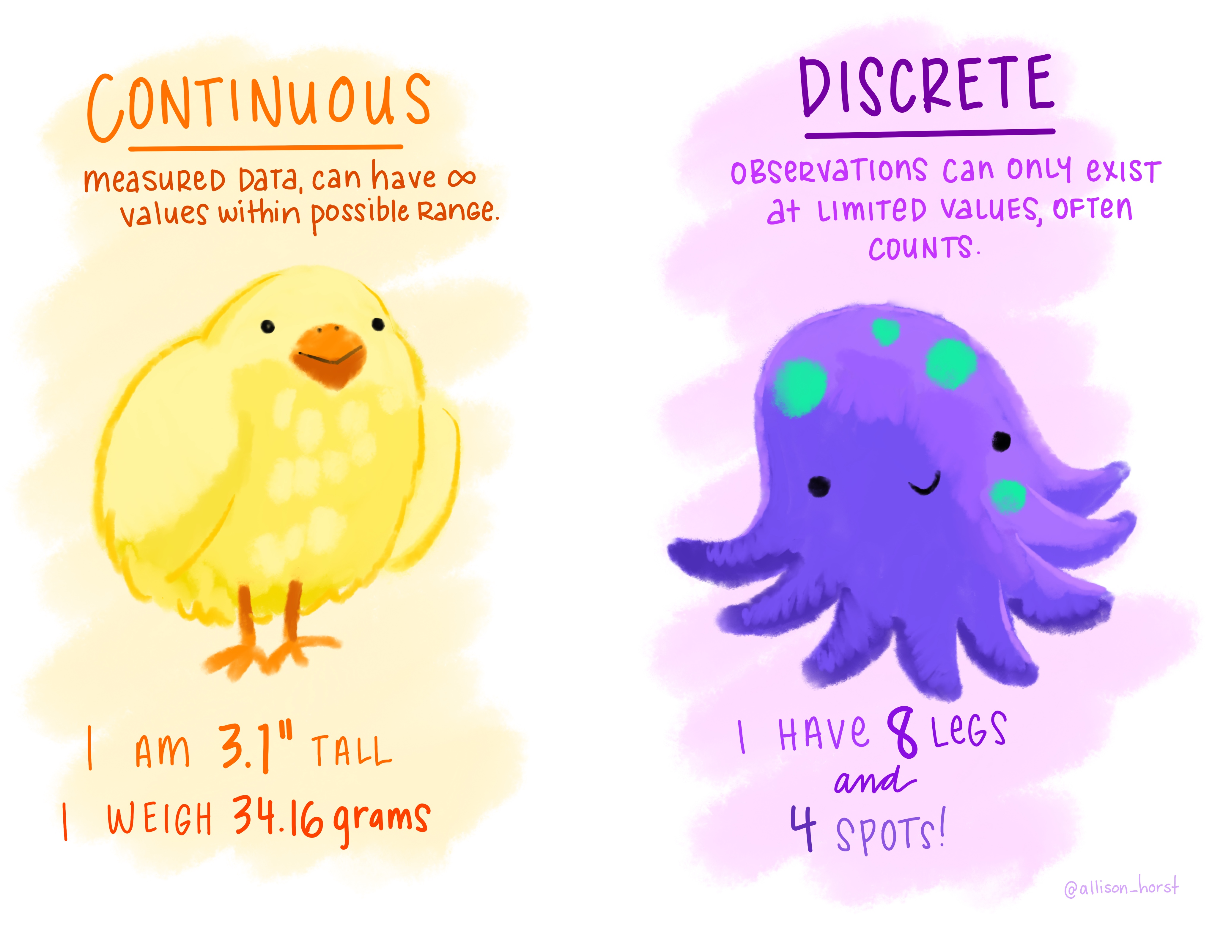
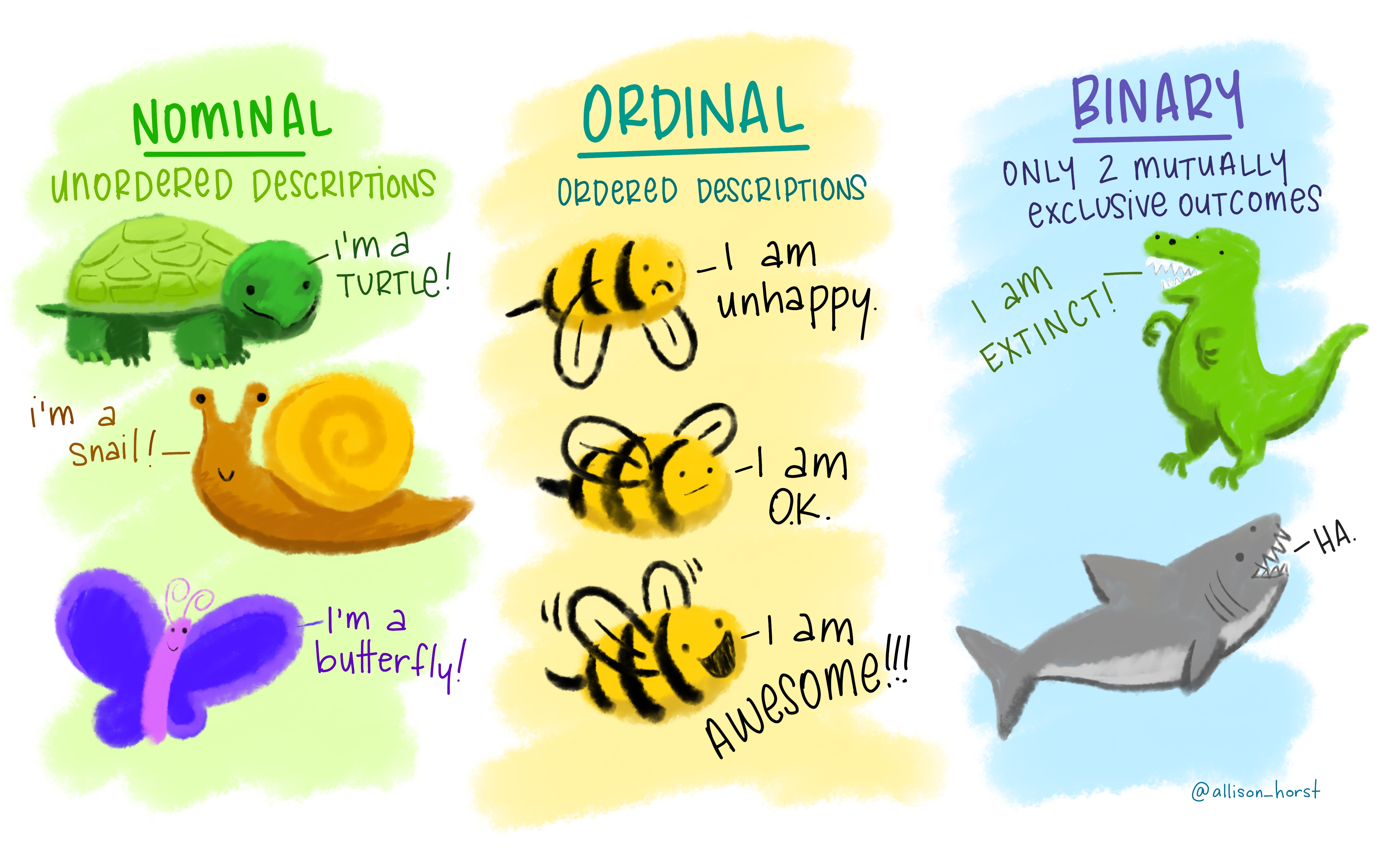
Data Tip: Variable Types
In data we often have variables (i.e. columns in a table) of different types. An important step when starting your analysis is to recognise which kind each variable is.
Numerical Categorical
Quality Control Checks
Whenever you read data into R, it’s always good practice to do some quality checks. Here’s a list of things to lookout for:
- Do you have the expected number of rows and columns?
- Are your variables (columns) of the expected type? (e.g. numeric, character)
- Is the range of numeric data within expected boundaries? For example: a column with months should go from 1 to 12; a column with human heights in cm should not have values below 30 or so; etc…
- Do you have the expected number of unique values in categorical (character) variables?
- Do you have missing values in the data, and were these imported correctly?
In R, you can answer many of these questions with the help of the following functions:
str(),summary(),length()+unique(),nrow(),ncol(),is.na().There are also some R packages that can help making these diagnostic analysis easier. One good one is the
skimrpackage (which has a goodintroduction document. If you use theskim()function with yourdata.frameit will give you a tabular summary that will help you answer all these questions in one go!
Visualising Data
Data visualisation is one of the fundamental elements of data analysis. It allows you to assess variation within variables and relationships between variables.
Choosing the right type of graph to answer particular questions (or convey a particular message) can be daunting. The data-to-viz website can be a great place to get inspiration from.
Here are some common types of graph you may want to do for particular situations:
- Look at variation within a single variable using histograms (
geom_histogram()) or, less commonly (but quite useful) empirical cumulative density function plots (stat_ecdf).- Look at variation of a variable across categorical groups using boxplots (
geom_boxplot()), violin plots (geom_violin()) or frequency polygons (geom_freqpoly()).- Look at the relationship between two numeric variables using scatterplots (
geom_point()).- If your x-axis is ordered (e.g. year) use a line plot (
geom_line()) to convey the change on your y-variable.Also, make sure you represent data on a suitable scale, for example:
- emphasising the right range of values (e.g. should your axis start at zero?)
- use suitable data transformations (e.g. when comparing relative changes, consider a log-scale - see this StatQuest video explaining logs).
When used effectively, aesthetics (colour, shape, size, transparency, etc.) and facets can be used to display many dimensions on a single graph.
Data Tip: Standardising Variables
Often it’s useful to standardise your variables, so that they are on a scale that can be interpreted and/or compared more easily. Here are some common ways to standardise data:
- Percentage (or fraction). This has no units.
- Mean-centering (each value minus the mean of the group). This has the same units as the original variable. It’s interpreted as the deviation of that observation from the group’s mean.
- Standard score (Z-score). This has no units. It can be interpreted as the number of standard deviations away from the mean.
Data tip: linking datasets
Combining datasets together is a very common task in data analysis, often referred to as data linkage.
Although this task might seem easy at a first glance, it can be quite challenging due to unforeseen properties of the data. For example:
- which variables in one table have a correspondence in the other table? (having the same column name doesn’t necessarily mean they are the same)
- are the values encoded similarly across datasets? (for example, one dataset might encode income groups as “low”, “medium”, “high” and another as “1”, “2”, “3”)
- were the data recorded in a consistent manner? (for example, an individual’s age might have been recorded as their date of birth or, due to confidentiality reasons, their age the last time they visited a clinic)
Thinking of these (and other) issues can be useful in order to avoid them when collecting your own data. Also, when you share data, make sure to provide with metadata, explaining as much as possible what each of your variables is and how it was measured.
Finally, it’s worth thinking that every observation of your data should have a unique identifier (this is referred to as a “primary key”). For example, in our data, a unique identifier could be created by the combination of the
countryandyearvariables, as those two define our unit of study in this case.
Data Tip: Cleaning Data
The infamous 80/20 rule in data science suggests that about 80% of the time is spend preparing the data for analysis. While this is not really a scientific rule, it does have some relation to the real life experience of data analysts.
Although it’s a lot of effort, and usually not so much fun, if you make sure to clean and format your data correctly, it will make your downstream analysis much more fluid, fruitful and pleasant.
Further reading
- Cheatsheets for dplyr, ggplot2 and more
- Data-to-Viz website with great tips for choosing the right graphs for your data
- Summary of dplyr functions and their equivalent in base R
Reference books:
- Holmes S, Huber W, Modern Statistics for Modern Biology - covers many aspects of data analysis relevant for biology/bioinformatics from statistical modelling to image analysis.
- Peng R, Exploratory Data Analysis with R - a general introduction to exploratory data analysis techniques.
- Grolemund G & Wickham H, R for Data Science - a good follow up from this course if you want to learn more about
tidyversepackages. - McElreath R, Statistical Rethinking - an introduction to statistical modelling and inference using R (a more advanced topic, but written in an accessible way to non-statisticians).
- Also see the lecture materials, which include access to the draft of the book’s second edition.
- James G, Witten D, Hastie T & Tibshirani R, Introduction to Statistical Learning - an introductory book about machine learning using R (also advanced topic).
- Also see this course material for a practical introduction to this topic.