Data visualisation with `ggplot2` - part II
Overview
Teaching: 50 min
Exercises: 30 minQuestions
How can we fully customise a plot, by adding annotations, labels, control the axis limits, and change its overall look?
How can we compose several plots together?
Objectives
Add labelling and annotations to a ggplot using
labs(),annotate(),geom_text(),geom_hline(),geom_vline(),geom_abline()andgeom_smooth().Customise the overall look of a plot using the
theme()family of functions.Use the
patchworkpackage to compose a grid of plots.
In this episode we’re going to expand on our skills using the ggplot2 package,
which will allow us to further customise our plots.
We’re also going to learn how to assemble several plots together, and export them in
a publication-ready manner.
For this lesson, we’ll use the smaller 2010 dataset. Let’s read it into R,
along with loading the tidyverse package. We also include some data cleaning
steps (using some of the tricks we’ve learned before):
# load package
library(tidyverse)

# read data - specify that missing values are encoded as an empty value
gapminder2010 <- read_csv("data/raw/gapminder2010_socioeconomic.csv", na = "")

# data cleaning
gapminder2010 <- gapminder2010 %>%
  # make the world region labels "prettier"
  # and calculate total population
  mutate(world_region = str_to_title(str_replace_all(world_region, "_", " "))) %>%
  # retain only a few columns of interest
  select(country, world_region, population,
         income_per_person, child_mortality, life_expectancy, children_per_woman)
Let’s also start by making an initial graph, which includes features that we’ve learned about in the introduction to ggplot episode:
ggplot(data = gapminder2010,
       aes(x = child_mortality, y = children_per_woman)) +
  geom_point(aes(colour = world_region, size = population)) +
  scale_colour_brewer(palette = "Dark2") +
  scale_size_continuous(trans = "log10")

Let’s revise what we’ve done here:
- We’ve defined
gapminder2010as the data frame to be used as data - We used the
geom_point()to draw points on the graph - We defined four aesthetics from columns of our data within
aes():xaxis withchild_mortalityyaxis withchildren_per_womancolourwithworld_regionsizewithpopulation
- We changed our colour scale:
- Using
scale_colour_brewer()we accessed one of the palettes provided by theRColorBrewerpackage (check them out here) - Using
scale_size_continuous()we transformed the data of this aesthetic to be on a log-scale (this helps with visualisation of very skewed data).
- Using
Let’s save this graph in an object (you can do this with ggplot graphs). This is optional, but often convenient when we want try different customisations or when assembling different plots together, as we will see later on.
# save our graph within an object called `p1`
p1 <- ggplot(data = gapminder2010,
             aes(x = child_mortality, y = children_per_woman)) +
  geom_point(aes(colour = world_region, size = population)) +
  scale_colour_brewer(palette = "Dark2") +
  scale_size_continuous(trans = "log10")
To view the plot, you can type it’s name on the console:
p1
Annotating your graphs
Labels
We can change the labels of every aesthetic using the labs() function, added on to
the graph.
For example:
p1 +
  labs(x = "Child mortality (per 1000 births)",
       y = "Children per woman",
       size = "Population",
       colour = "Region",
       tag = "A",
       title = "Relationship between child mortality and fertility rate",
       subtitle = "Based on Gapminder data from 2010",
       caption = "done with ggplot2 in R")

Note: the tag label is particularly useful for numbering panels in composite figures.
However, we will see an even more convenient way of doing it later on using the patchwork package.
Labelling data points
You can use the geom_text() or geom_label() functions to add labels to your data
points. These two geometries work similarly to geom_point(), except they also need
an aesthetic called label to indicate which variable should be used as the text to
plot.
For example, let’s label each of our countries with their respective name:
p1 +
  geom_text(aes(label = country))

Wow! That’s a bit too much, and not very informative. We can do better, by telling the geometry to check for overlaps:
p1 +
  geom_text(aes(label = country), check_overlap = TRUE)

Another strategy to annotate points, is to take advantage of the fact that geometries can take different data as their input.
For example, let’s create a new table containing the countries with the highest and lowest incomes in each world region (we can use a grouped filter for this):
extreme_income <- gapminder2010 %>%
  # remove missing values in this variable, and then...
  filter(!is.na(income_per_person)) %>%
  # group by world region, and then...
  group_by(world_region) %>%
  # retain cases that have the maximum or minimum income observed, and then...
  filter(income_per_person == max(income_per_person) | income_per_person == min(income_per_person)) %>%
  # remove grouping information
  ungroup()

# we have 12 rows of data in this filtered table
# makes sense as we expect to have a min and max for each of 6 world regions
extreme_income
# A tibble: 12 x 7
   country world_region population income_per_pers… child_mortality
   <chr>   <chr>             <dbl>            <dbl>           <dbl>
 1 Afghan… South Asia     29185511             1672           88.0
 2 Brunei  East Asia P…     388634            80556            9.66
 3 Djibou… Middle East…     840194             2673           76.4
 4 Equato… Sub Saharan…     943640            33990          112.
 5 Haiti   America         9949318             1510          209.
 6 Luxemb… Europe Cent…     507890            91743            2.99
 7 Maldiv… South Asia       365730            11965           13.8
 8 North … East Asia P…   24548840             1713           29.5
 9 Qatar   Middle East…    1856329           119974            9
10 Somalia Sub Saharan…   12043886              614          157.
11 Tajiki… Europe Cent…    7527397             2138           43.2
12 United… America       309011469            49479            7.33
# … with 2 more variables: life_expectancy <dbl>, children_per_woman <dbl>
Now, we add the geom_text() like before, but tell it to use this new table as its data:
p1 +
  geom_text(data = extreme_income,
            aes(label = country))

It’s still not a perfect visualisation (there’s still some overlap and some of the
labels fall out of the plotting area). For situations like this, it may help
to use the ggrepel package,
with its geom_text_repel() and geom_label_repel() geometries).
Free annotations
You can also use the more general annotate() function to add any kind of geometry
to your graph.
Here’s an example with 3 distinct annotations, each using a different geometry:
p1 +
  # add rectangle
  annotate(geom = "rect", alpha = 0.3,
           xmin = 50, xmax = 170, ymin = 6, ymax = 8) +
  # add a segment
  annotate(geom = "segment", x = 170, xend = 200, y = 2.5, yend = 3.1) +
  # add some text
  annotate(geom = "text", x = 150, y = 2.3, label = "Clear outlier")

Adding annotations “manually” can be tedious, as it requires a lot of trial-and-error to get it just right, but it can be convenient when we want to highlight something very specific in our graph.
Adding horizontal, vertical, sloped and trend lines
You can use geom_hline() and geom_vline() to add horizontal and vertical lines,
respectively. These can be useful, for example, to mark thresholds that you want to
highlight.
# Highlight regions with child mortality over/below 50
# and fertility over/below 3 children
p1 +
  geom_hline(yintercept = 3, size = 1) +
  geom_vline(xintercept = 50, size = 1)

You can also add a sloped line, using geom_abline(), which needs information about
the y-intercept and slope of the line:
p1 +
  geom_abline(intercept = 0, slope = 0.05, size = 2)

This function is often useful to use when looking at the correlation between two
variables on the same scale, and thus highlighting x = y (intercept = 0, slope = 1,
which is the default of the function).
Finally, you can also use geom_smooth() to add a trendline to your data.
p1 + geom_smooth()
`geom_smooth()` using method = 'loess' and formula 'y ~ x'

What geom_smooth() does is fit a model to the data, and then graphs the mean prediction
(with error estimate) from that model. By default, the model used is a
LOESS regression. Another common usage is to display
the result of a linear regression fit to the data,
in which case we can change the method option to “lm” (to use the linear model
function from R):
p1 + geom_smooth(method = "lm")
`geom_smooth()` using formula 'y ~ x'

You can also remove the standard error by setting se = FALSE inside the function.
Adjusting axis limits (zooming)
You can use the coord_cartesian() function to adjust x and y limits. For example,
let’s highlight the countries with lower fertility and mortality rates
(using the geom_text() showing countries extreme incomes from a previous graph):
p1 +
  geom_text(data = extreme_income, aes(label = country)) +
  coord_cartesian(xlim = c(0, 25), ylim = c(1, 3))

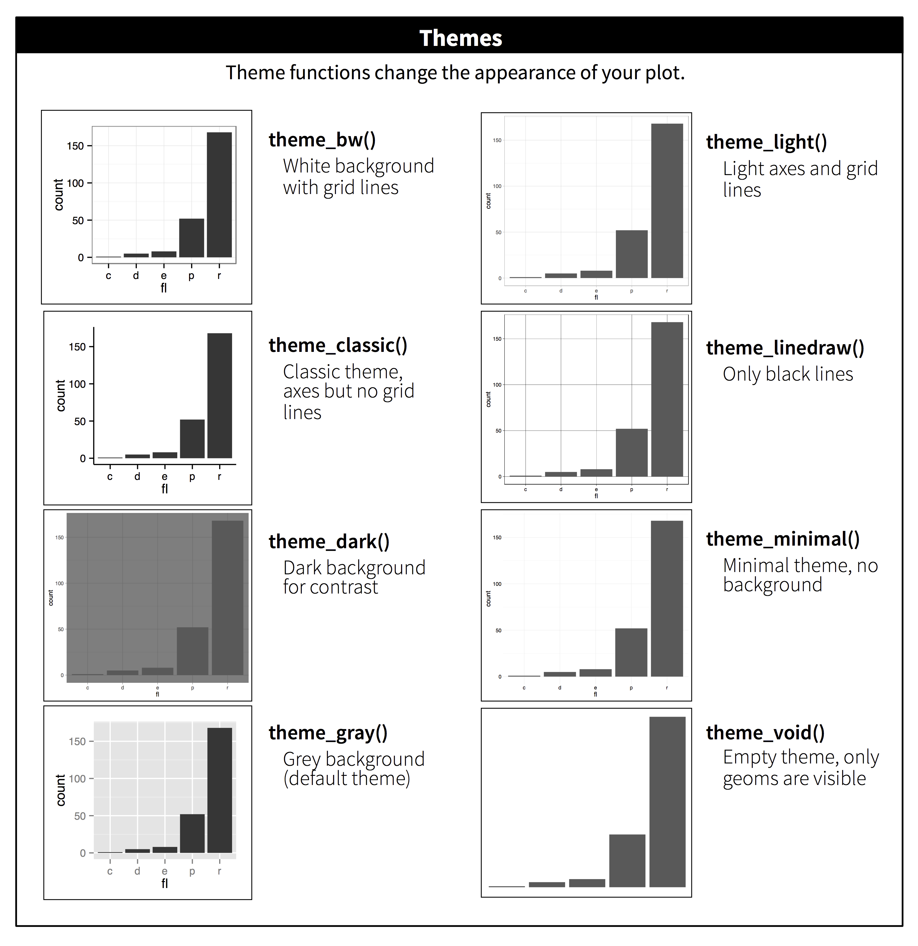
Themes
You can change the overall look of your graphs by customising the so-called theme
used by ggplot2.
Using built-in themes
ggplot2 comes with some pre-defined themes, which can be accessed using
the theme_* family of functions. For example, let’s use theme_classic()
for a cleaner-looking graph:
p1 +
  theme_classic()

Here’s the themes available with ggplot2:
There are also packages that provide with other themes. One of them is the
ggthemes package
(you can install it with install.packages("ggthemes")), which also provides
some aditional colour scales, including colour blind friendly ones.
Finer customisation with theme()
To tune individual elements of the graph, you can use the generic theme() function.
This allows you to change the look of every single aspect of the graph, so we cannot
cover it all here (look at ?theme documentation to see how many things you can
customise!). With this function you can essentially make your own theme.
Here’s some uses of this function that might be useful (try running them yourself!):
# Change the font size
p1 + theme(text = element_text(size = 16))

# Remove legend
p1 + theme(legend.position = "none") # can also use "top", "bottom", "left"

# Change orientation of the x-axis text
p1 + theme(axis.text.x = element_text(angle = 45, hjust = 1))

# Adjust each grid line
p1 + theme(panel.grid.minor.x = element_blank(),
           panel.grid.major.x = element_blank(),
           panel.grid.minor.y = element_blank(),
           panel.grid.major.y = element_line(colour = "black", linetype = "dotted"))
In most cases, the way to figure out how to do these customisations is to do a web search. For example searching for “ggplot2 how to change axis text orientation” returns this stackoverflow answer as one of the top results.
Setting up a custom theme
To avoid having to add the theme functions to every graph you make, you can set
the default theme you want to use for your graphs using the theme_set() function.
Usually, it may be a good idea to include this at the top of your script, just after you load the libraries:
# Use the "classic" theme as the basis,
# with horizontal gridlines for the y axis and a bigger font
theme_set(theme_classic() +
            theme(panel.grid.major.y = element_line(colour = "black", linetype = "dotted"),
                  text = element_text(size = 16)))
Now, every time you display your graphs, they will use the theme set in this way:
p1

Exercise
Combining what we’ve learned so far, try and create the following 3 graphs, which should be saved as
p1,p2andp3.Hints:
- update your
p1graph by adding an annotation with a rectangle withxmin = 0, xmax = 25, ymin = 1, ymax = 3. Also add labels to the axis and scales.p2is identical top1, that it’s “zoomed-in” on the area defined by the box inp1.- for
p3, make sure the y-axis is on a log scale (usingscale_y_continuous()); use theannotate_logticks()function to add the ticks on the y-axis; and use thetheme()function to ensure the legend doesn’t show and that the x-axis labels are at a 45 degree angle.
Answer
Here is the full code for each plot:
p1 <- ggplot(data = gapminder2010,
             aes(x = child_mortality, y = children_per_woman)) +
  geom_point(aes(colour = world_region, size = population)) +
  scale_colour_brewer(palette = "Dark2") +
  scale_size_continuous(trans = "log10") +
  annotate(geom = "rect", xmin = 0, xmax = 25, ymin = 1, ymax = 3,
           colour = "grey", fill = NA) +
  labs(x = "Child mortality (per 1000)", y = "Fertility rate (per woman)",
       colour = "Income", size = "Population")

p2 <- ggplot(data = gapminder2010,
             aes(x = child_mortality, y = children_per_woman)) +
  geom_point(aes(colour = world_region, size = population)) +
  scale_colour_brewer(palette = "Dark2") +
  scale_size_continuous(trans = "log10") +
  coord_cartesian(xlim = c(0, 25), ylim = c(1, 3)) +
  labs(x = "Child mortality (per 1000)", y = "Fertility rate (per woman)",
       colour = "Income", size = "Population")

p3 <- gapminder2010 %>%
  ggplot(aes(world_region, income_per_person)) +
  geom_boxplot(aes(fill = world_region)) +
  scale_fill_brewer(palette = "Dark2") +
  scale_y_continuous(trans = "log10") +
  annotation_logticks(sides = "l") +
  labs(x = "World Region", y = "Yearly income per person (dollars)") +
  theme(legend.position = "none",
        axis.text.x = element_text(angle = 45, hjust = 1))

Composing plots
To compose several plots together, we will use the
patchwork package (check it’s documentation,
which is full of excelent examples of its usage).
The easiest way to use the package is to first save the individual plots we want to assemble in different objects. Let’s use the plots we made in our exercise.
There are different ways in which you can specify how to put graphs together using
patchwork, but the way we’re going to use in this lesson uses these two operators:
p1 | p2puts the first plot on the left and the second on the rightp1 / p2puts the first plot on the top and the second on the bottom
Here is an example using the plots we’ve made on our exercise:
# side by side
p1 | p2

# top and bottom
p1 / p2

We can combine these two operators for more complex arrangements, by wrapping
different parts of the grid of plots with (). For example:
# Put p1 and p2 side by side. Then put those on the top and p3 on the bottom
(p1 | p2) / p3

Finally, you can customise these arrangements in several ways using the plot_layout()
function. For example, we can “colect” the legends and define the relative height of
each panel:
( (p1 | p2) / p3 ) +
  plot_layout(guides = "collect", heights = c(2, 1))

We can use plot_spacer() to add an empty space to our graph, which can
be useful if we want to add something else later on using another program (e.g.
an image).
For example, let’s put a “blank” space where the second plot should be
( (p1 | plot_spacer()) / p3 ) +
  plot_layout(guides = "collect", heights = c(2, 1))

Finally, we can also add annotations, which is very useful to add automatic “tags” to each panel:
( (p1 | p2) / p3 ) +
  plot_layout(guides = "collect", heights = c(2, 1)) +
  plot_annotation(tag_levels = "A",
                  title = "Figure 1")

Saving graphs
We’ve already covered how to use the ggsave() function in the first ggplot2 lesson.
To save assembled graphs, you can do a similar thing, but instead of saving a single
graph, you can save the whole assembly into an object, and then pass that to ggsave():
# Save the "patch" of graphs into an object called fig1
fig1 <- ( (p1 | p2) / p3 ) +
  plot_layout(guides = "collect", heights = c(2, 1)) +
  plot_annotation(tag_levels = "A",
                  title = "Figure 1")

# save it as PDF using 15cm x 7cm
ggsave(filename = "figures/socio_economic_graphs.pdf",
       plot = fig1,
       width = 15,
       height = 7,
       units = "cm")
Extra functionality
this section is still under development, but you can peek at the code to get some new tricks
Adding summaries
We’ve seen how to summarise data using group_by() %>% summarise(). However, sometimes
it is useful to calculate and display a summary metric directly on the graph.
gapminder2010 %>%
  ggplot(aes(world_region, children_per_woman)) +
  geom_violin(scale = "width", fill = "grey") +
  geom_pointrange(stat = "summary", fun.data = "mean_cl_boot") +
  geom_line(stat = "summary", fun.data = "mean_cl_boot", aes(group = 1)) +
  theme(axis.text.x = element_text(angle = 45, hjust = 1)) +
  labs(x = "World Region", y = "Fertility rate")

Using factors to improve visualisation
This is OK, but a bit disorganised:
gapminder2010 %>%
  count(world_region) %>%
  ggplot(aes(x = world_region, y = n)) +
  geom_col() +
  coord_flip()

This is much better:
gapminder2010 %>%
  count(world_region) %>%
  # turn world region into an ordered factor
  mutate(world_region = fct_reorder(world_region, n)) %>%
  ggplot(aes(x = world_region, y = n)) +
  geom_col() +
  coord_flip()

Key Points
Use
labs()to customise the labels of your plot’s aesthetics (e.g.x,y,colour,fill,size, etc.).Use
annotate()to freely add text, segments or rectangles to your plot.Use built-in
theme_*()functions to change the overall look of your graphs.Use
theme()to change the look of every single element of the graph.Use
set_theme()to change the theme for the rest of your R session.Use the
patchworkpackage to compose graphs, using the|and/operators to place two plots side-by-side or top-and-bottom, respectively.The
plot_layout()function can be used to adjust your plot arrangement. Useful options arewidthsandheightsto adjust the relative size of the panels, andguides = 'collect'to make a single legend common to the whole figure.Use
plot_annotation(tag = 'A')to automatically add a letter tag to each panel.