Extra practice exercises
Overview
Teaching: 0 min
Exercises: 0 minQuestions
How to apply the tools and concepts learned to new data?
Objectives
Use R and the
tidyversecollection of packages to explore a new dataset.
This document suggests new exercises to practice the skills and concepts learned in the course. Each exercise section links to one or several of the main lesson episodes it refers to.
(Note: solutions are not yet available for these exercises and will be added in time)
Starting a data analysis project
This exercise uses skills learned in the episodes Introduction to R and RStudio, Basic objects and data types in R and Working with Tabular Data.
For this set of questions, we will use a new dataset from the Gapminder Foundation, which includes data about energy consumption and CO2 emmissions in the different countries. This new data file includes the following variables:
| Column | Description |
|---|---|
| country | country name |
| world_region | 6 world regions |
| year | year that each datapoint refers to |
| yearly_co2_emissions | yearly CO2 emissions, 1000 metric tones |
| energy_use_per_person | energy use per person |
| energy_production_per_person | energy production per person |
Part I - setting up your project
- On your computer, create a new directory for this project, for example
gapminder-energy - Create a new R Project on this directory
- Create directories that you feel are important, including one for saving the raw data.
- Download the gapminder energy dataset and save it in your project’s data folder. (right-click the file link and choose “Save link as…”)
- Install the
skimrpackage, which you will use to do some quality control checks on the data file. (Hint:install.packages())
Part II - reading and checking quality of data
- Read the
gapminder1990to2010_energy.tsvfile into adata.frame/tibbleobject calledenergy. (Hint: note that this is a tab-delimited file.) - Make a basic check that your data import went well. Your data frame should have
3968 rows and 7 columns. (Hint: use
summary()andstr()to check data integrity) - Use the
skim()function from theskimrpackage to get an informative summary of your data frame. Make sure columns were imported as the correct type of value, and that you have the expected number of categories for character columns. (Hint: don’t forget to load the package first withlibrary())
Note any problems you find during this exploratory analysis.
Data Visualisation
Following from the previous exercise on the gapminder1990to2010_energy.tsv dataset:
- Use a histogram to investigate the distribution of yearly CO2 emissions in the dataset. Consider whether the original scale is adequate.
- Has the distribution of yearly CO2 emissions changed dramatically over the years?
Try using
geom_density()orgeom_freqpoly()with the following aestheticgroup = year. (to ensure one line is drawn for each year). - Look at the trend over time (x-axis) of CO2 emissions (y-axis) for each country,
both on a linear and on a log scales. How does the scale change your perception of the data?
(hint use
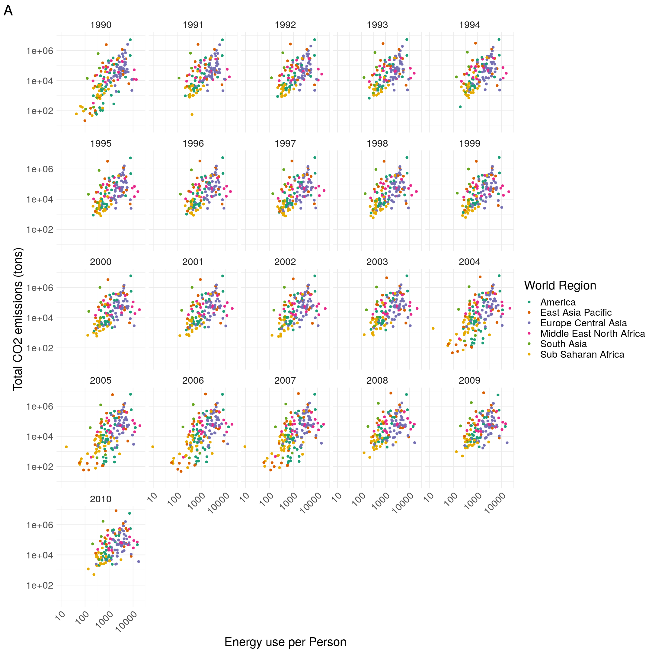
geom_line()withaes(group = country)). - Try and recreate the following graph, showing the relationship between energy use and CO2 emissions. Note that the axis are on a log-scale. The “Dark2” palette was used from the brewer colour scale.

Data manipulation
The gapminder1990to2010_energy.tsv dataset contains some mistakes that need correcting.
Create a new table, energy_clean, that has the following issues fixed:
- Convert the
energy_production_per_personfrom character to numeric. (hint: use theas.numeric()function withinmutate()) countryhas 191 unique categories, whereascountry_idhas 190 (you can check this withunique(energy$country)andunique(energy$country_id)). One of the countries, Brazil is spelled with an “s” and a “z”. Change the values of “Brasil” to “Brazil”. (hint: use theifelse()function withinmutate())
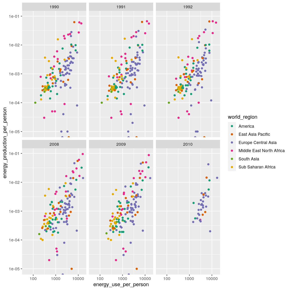
From the new table, try and fix the following code, by writing the correct condition
in filter(), which produces the plot below:
energy_clean %>%
  filter(FIXME) %>%
  ggplot(aes(energy_use_per_person, energy_production_per_person)) +
  geom_point(aes(colour = world_region)) +
  facet_wrap(facets = vars(year)) +
  scale_x_continuous(trans = "log10") +
  scale_y_continuous(trans = "log10") +
  scale_colour_brewer(palette = "Dark2")

Key Points
The initial exploration of data is crucial to detect any data quality issues that need fixing.