Grouped operations using `dplyr`
Overview
Teaching: 50 min
Exercises: 30 minQuestions
How to calculate summary statistics from a dataset?
How to apply those summaries to groups within the data?
How to apply other data manipulation steps to groups within the data?
Objectives
Recognise when to use grouped operations in data analysis.
Differentiate between grouped summaries and other types of grouped operations.
Apply grouped summaries using the
group_by()+summarise()functions.Apply other grouped operations such as:
group_by()+filter()andgroup_by()+mutate().Recognise the importance of the
ungroup()function.
In this lesson we’re going to learn how to use the dplyr package to make calculations
for sub-groups in our data.
As usual when starting an analysis on a new script, let’s start by loading the packages and reading the data. We will continue with gapminder data from 1960 to 2010:
library(tidyverse)

# Read the data, specifying how missing values are encoded
gapminder1960to2010 <- read_csv("data/raw/gapminder1960to2010_socioeconomic.csv",
                                na = "")
Summarising data
A common task in data analysis is to summarise variables to get a sense of their average and variation.
We can achieve this task using the summarise() function. For example, let’s calculate
what the mean and standard deviation are for life expectancy:
gapminder1960to2010 %>%
  summarise(life_expect_mean = mean(life_expectancy, na.rm = TRUE),
            life_expect_sd = sd(life_expectancy, na.rm = TRUE))
# A tibble: 1 x 2
  life_expect_mean life_expect_sd
             <dbl>          <dbl>
1             64.0           10.3
A couple of things to notice:
- The output of summarise is a new table, where each column is named according to the
input to
summarise(). - Within
summarise()we should use functions for which the output is a single value.
Also notice that, above, we used the na.rm option within the summary functions,
so that they ignored missing values when calculating the respective statistics.
Summary functions
There are many functions whose input is a vector (or a column in a table) and the output is a single number. Here are several common ones:
mean(x)- arithmetic meanmedian(x)- mediansd(x)- standard deviationvar(x)- varianceIQR(x)- interquartile rangemad(x)- median absolute deviationmin(x)andmax(x)- minimum and maximumquantile(x, probs = 0.75)- quantile (use theprobsoption to set the quantile of your choosing)sum(x)- addition of all values in “x”n_distinct(x)(fromdplyr) - the number of distinct values in the vector “x”All of these have the option
na.rm, which tells the function remove missing values before doing the calculation.
Grouped summaries
In most cases we want to calculate summary statistics within groups of our data.
We can achieve this by combining summarise() with the group_by() function.
For example, let’s modify the previous example to calculate the summary for each
income_group:
gapminder1960to2010 %>%
  group_by(income_groups) %>%
  summarise(life_expect_mean = mean(life_expectancy, na.rm = TRUE),
            life_expect_sd = sd(life_expectancy, na.rm = TRUE))
`summarise()` ungrouping output (override with `.groups` argument)
# A tibble: 4 x 3
  income_groups       life_expect_mean life_expect_sd
  <chr>                          <dbl>          <dbl>
1 high_income                     73.0           5.10
2 low_income                      51.8           7.68
3 lower_middle_income             58.7           7.85
4 upper_middle_income             66.9           7.15
The table output now includes both the columns we defined within summarise()
as well as the grouping columns defined within group_by().
Exercise
- Calculate the median
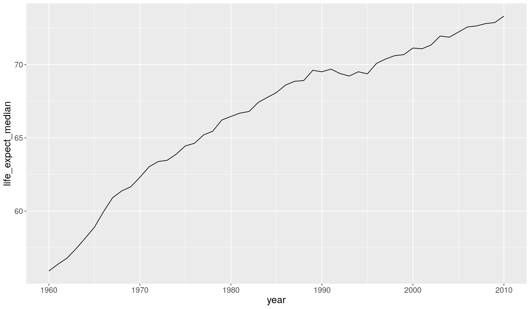
life_expectancyfor each year. Can you make a line plot to visualise how it changed over time?- Modify the previous code to calculate the median
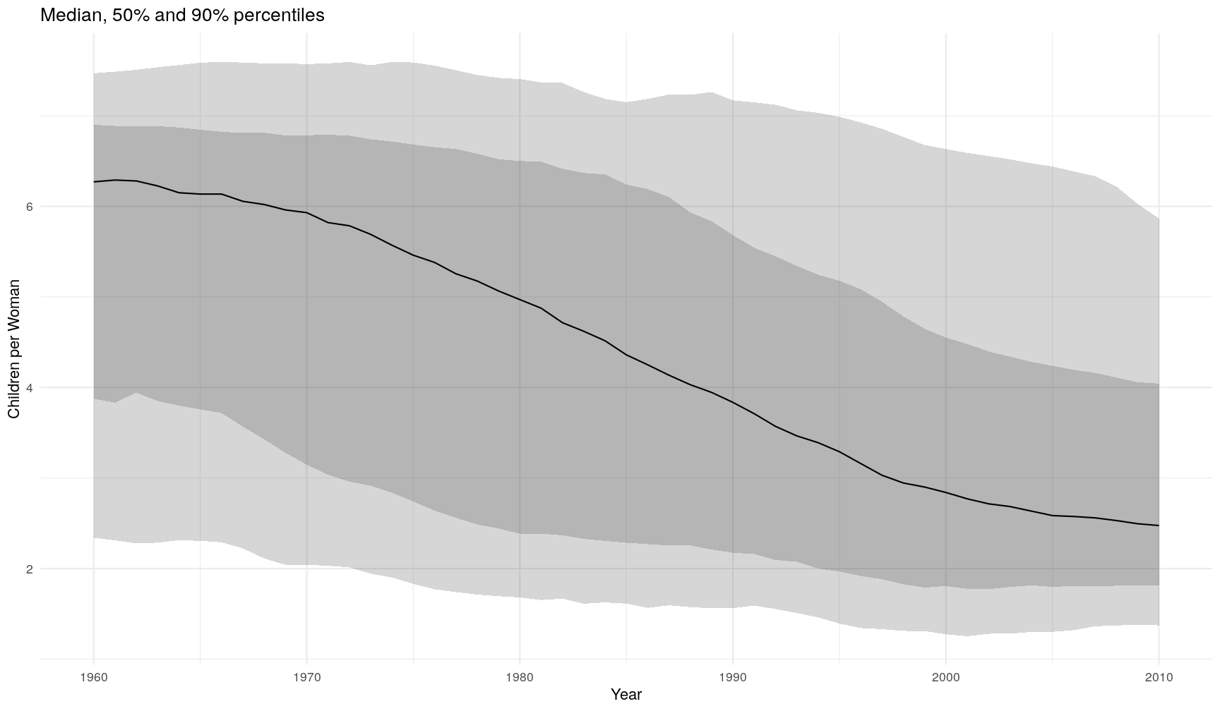
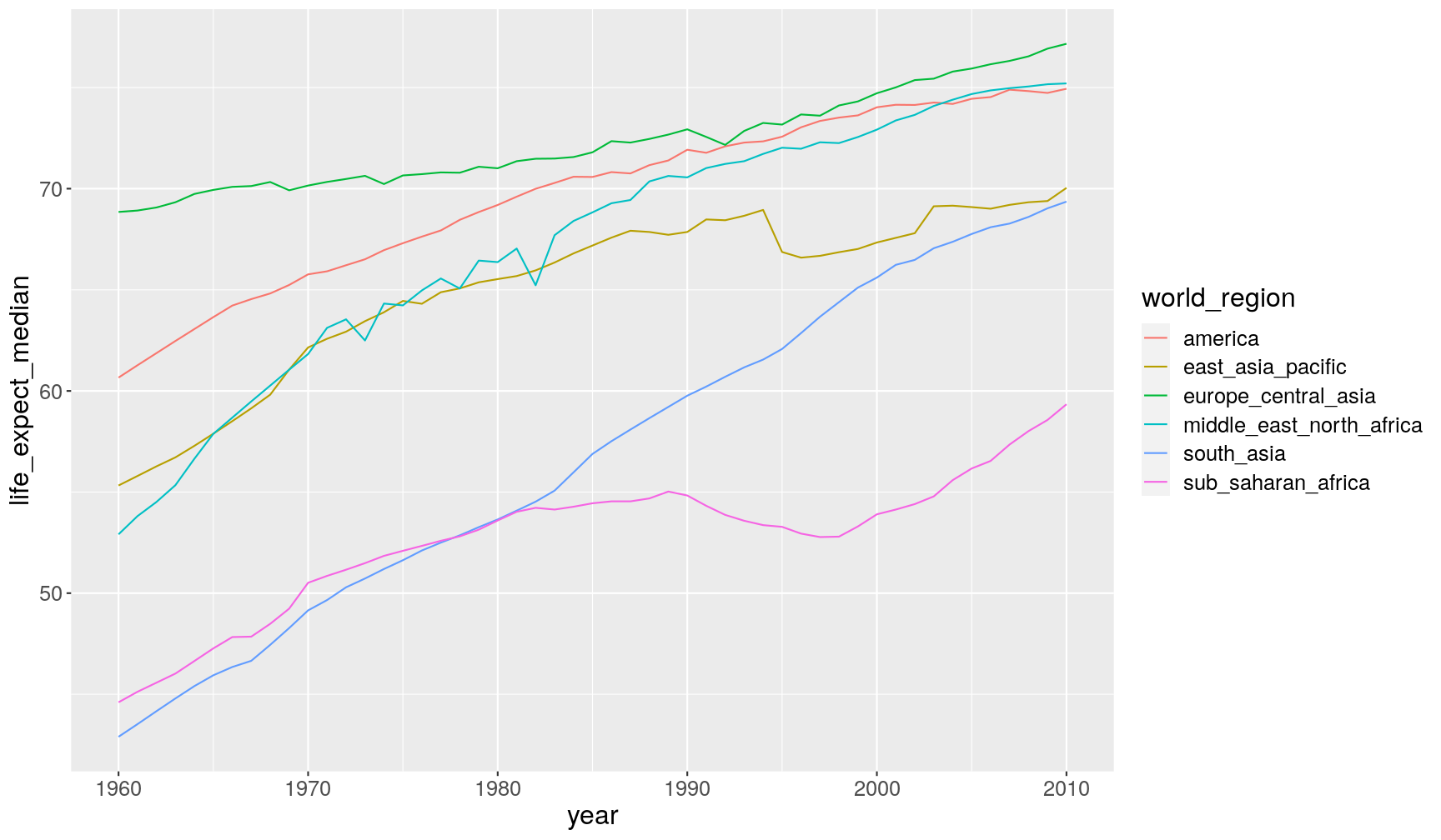
life_expectancyper year and world region. Can you modify your graph by colouring each line by world region?- Fix the following code (where “FIXME” appears) to recreate the graph below.
gapminder1960to2010 %>%
  # remove rows with missing values for children_per_woman
  filter(FIXME) %>%
  # grouped summary
  group_by(year) %>%
  summarise(q5 = quantile(children_per_woman, probs = 0.05),
            q25 = quantile(children_per_woman, probs = 0.25),
            median = median(children_per_woman),
            q75 = quantile(children_per_woman, FIXME),
            q95 = quantile(children_per_woman, FIXME)) %>%
  # plot
  ggplot(aes(year, median)) +
  geom_ribbon(aes(ymin = q5, ymax = q95), alpha = 0.2) +
  geom_ribbon(aes(ymin = FIXME, ymax = q75), alpha = 0.2) +
  geom_line() +
  theme_minimal() +
  labs(FIXME)
`summarise()` ungrouping output (override with `.groups` argument)
Answer
A1. To calculate the median per year, we combine
group_by()andsummarise():gapminder1960to2010 %>% group_by(year) %>% summarise(life_expect_median = median(life_expectancy, na.rm = TRUE))`summarise()` ungrouping output (override with `.groups` argument)# A tibble: 51 x 2 year life_expect_median <dbl> <dbl> 1 1960 55.9 2 1961 56.4 3 1962 56.8 4 1963 57.4 5 1964 58.2 6 1965 58.9 7 1966 60.0 8 1967 60.9 9 1968 61.4 10 1969 61.7 # … with 41 more rowsTo create the desired plot, we could pipe the previous code directly to ggplot:
gapminder1960to2010 %>% group_by(year) %>% summarise(life_expect_median = median(life_expectancy, na.rm = TRUE)) %>% ggplot(aes(year, life_expect_median)) + geom_line()`summarise()` ungrouping output (override with `.groups` argument)
A2. To get the change per year and also world region, we can add
world_regiontogroup_by():gapminder1960to2010 %>% group_by(year, world_region) %>% summarise(life_expect_median = median(life_expectancy, na.rm = TRUE))`summarise()` regrouping output by 'year' (override with `.groups` argument)# A tibble: 306 x 3 # Groups: year [51] year world_region life_expect_median <dbl> <chr> <dbl> 1 1960 america 60.7 2 1960 east_asia_pacific 55.3 3 1960 europe_central_asia 68.8 4 1960 middle_east_north_africa 52.9 5 1960 south_asia 42.9 6 1960 sub_saharan_africa 44.6 7 1961 america 61.3 8 1961 east_asia_pacific 55.8 9 1961 europe_central_asia 68.9 10 1961 middle_east_north_africa 53.8 # … with 296 more rowsAnd we can modify our previous graph, by adding a colour aesthetic to
geom_line():gapminder1960to2010 %>% group_by(year, world_region) %>% summarise(life_expect_median = median(life_expectancy, na.rm = TRUE)) %>% ggplot(aes(year, life_expect_median)) + geom_line(aes(colour = world_region))`summarise()` regrouping output by 'year' (override with `.groups` argument)
A3. Here is the fixed code:
gapminder1960to2010 %>%
  # remove rows with missing values for children_per_woman
  filter(!is.na(children_per_woman)) %>%
  # grouped summary
  group_by(year) %>%
  summarise(q5 = quantile(children_per_woman, probs = 0.05),
            q25 = quantile(children_per_woman, probs = 0.25),
            median = median(children_per_woman),
            q75 = quantile(children_per_woman, probs = 0.75),
            q95 = quantile(children_per_woman, probs = 0.95)) %>%
  # plot
  ggplot(aes(year, median)) +
  geom_ribbon(aes(ymin = q5, ymax = q95), alpha = 0.2) +
  geom_ribbon(aes(ymin = q25, ymax = q75), alpha = 0.2) +
  geom_line() +
  theme_minimal() +
  labs(x = "Year", y = "Children per Woman",
       title = "Median, 50% and 90% percentiles"
Counting observations per group
One common question when summarising data in this way, is to know how many observations
(rows) there are for each group. We can achieve this with the special n() function,
which is specifically designed to be used within summarise().
For example, let’s take our previous summary of life expectancy per income group and add the number of observations (rows) in each group:
gapminder1960to2010 %>%
  group_by(income_groups) %>%
  summarise(life_expect_mean = mean(life_expectancy, na.rm = TRUE),
            life_expect_sd = sd(life_expectancy, na.rm = TRUE),
            n_obs = n())
`summarise()` ungrouping output (override with `.groups` argument)
# A tibble: 4 x 4
  income_groups       life_expect_mean life_expect_sd n_obs
  <chr>                          <dbl>          <dbl> <int>
1 high_income                     73.0           5.10  2907
2 low_income                      51.8           7.68  1581
3 lower_middle_income             58.7           7.85  2397
4 upper_middle_income             66.9           7.15  2958
Notice that this gives you the total number of rows per group. But because of missing data, we might have less observations with actual life expectancy information.
Counting non-missing observations
To count how many values had complete data for life_expectancy, we can use a trick
by combining the sum() and is.na() functions in the following way:
gapminder1960to2010 %>%
  group_by(income_groups) %>%
  summarise(life_expect_mean = mean(life_expectancy, na.rm = TRUE),
            life_expect_sd = sd(life_expectancy, na.rm = TRUE),
            n_obs_total = n(),
            n_obs_life_expect = sum(!is.na(life_expectancy)))
`summarise()` ungrouping output (override with `.groups` argument)
# A tibble: 4 x 5
  income_groups     life_expect_mean life_expect_sd n_obs_total n_obs_life_expe…
  <chr>                        <dbl>          <dbl>       <int>            <int>
1 high_income                   73.0           5.10        2907             2693
2 low_income                    51.8           7.68        1581             1581
3 lower_middle_inc…             58.7           7.85        2397             2397
4 upper_middle_inc…             66.9           7.15        2958             2836
But what is that sum(!is.na(life_expectancy))? Let’s use a simpler example with
a vector to understand what is happening.
some_numbers <- c(1, 2, NA, 30, NA, 22)
The first thing to remember is that is.na() returns a logical vector:
# returns TRUE if value is NOT missing (remember the exclamation mark)
!is.na(some_numbers)
[1] TRUE TRUE FALSE TRUE FALSE TRUE
Because R encodes TRUE as the value 1 and FALSE as the value 0, we can use the
sum() function, which will add up the value 1 for all the TRUEs, which effectively
is the same as counting how many values are not missing:
sum(!is.na(some_numbers))
[1] 4
This trick can be used with any kind of logical vector. For example, if we wanted to know how many numbers were above 10:
# this is the condition - note the missing values in the output
some_numbers > 10
[1] FALSE FALSE NA TRUE NA TRUE
# this is how many cases are TRUE - note we need to tell the function to remove NAs
sum(some_numbers > 10, na.rm = TRUE)
[1] 2
Exercise
Using
group_by()&summarise(), calculate the following for eachyearandworld_region(save the output in a new table calledincome_summary:
- The mean and standard deviation of income.
- The total number of observations (in our case this corresponds to number of countries) (hint:
n()).- The number of observations that have data for
income_per_person(hint:sum(!is.na(your_variable))).- The number of observations for which
income_per_personis less than 365*2 ($2 per day).(optional) Graph the output as a line chart showing the change of each variable over time.
Answer
Here is the solution, we
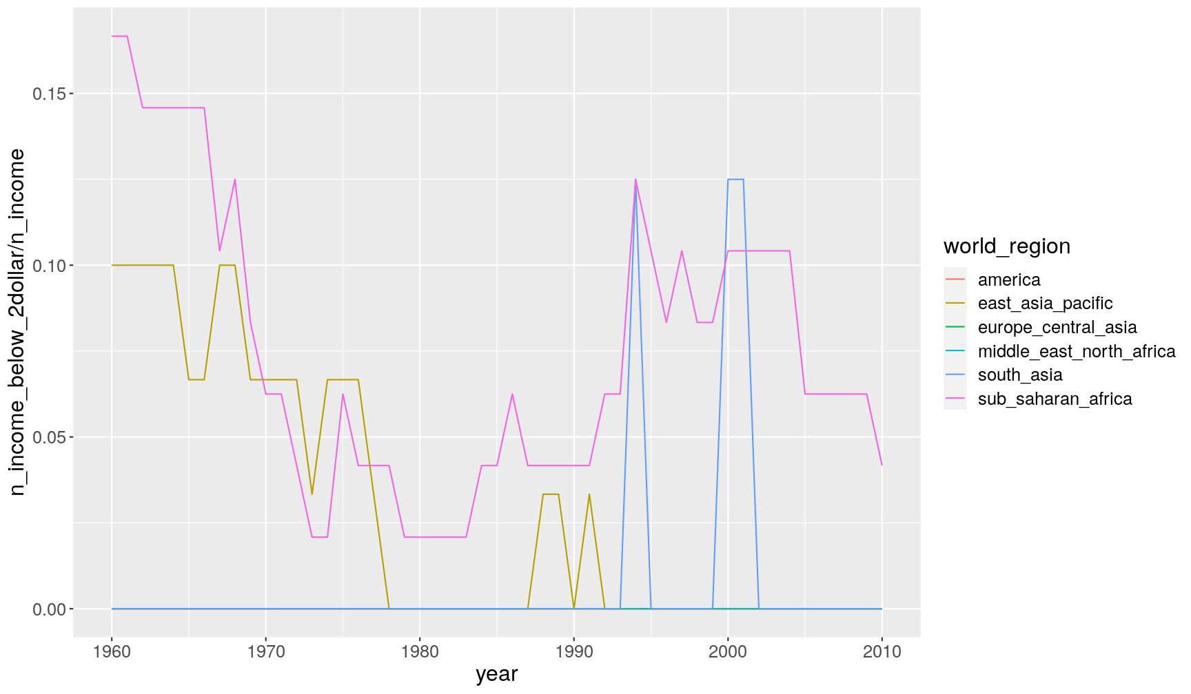
group_by(year, world_region)and then pipe the grouped table tosummarise(), where we use calculate the requested statistics:income_summary <- gapminder1960to2010 %>% group_by(year, world_region) %>% summarise(mean_income = mean(income_per_person, na.rm = TRUE), sd_income = sd(income_per_person, na.rm = TRUE), n_total = n(), n_income = sum(!is.na(income_per_person)), n_income_below_2dollar = sum(income_per_person < 365*2, na.rm = TRUE))`summarise()` regrouping output by 'year' (override with `.groups` argument)For example, here we show the proportion of countries that have income less than $2, so we divide
n_income_below_2dollar(number of countries below this income) byn_income(number of countries with non-missing data for income):income_summary %>% ggplot(aes(year, n_income_below_2dollar/n_income)) + geom_line(aes(colour = world_region))
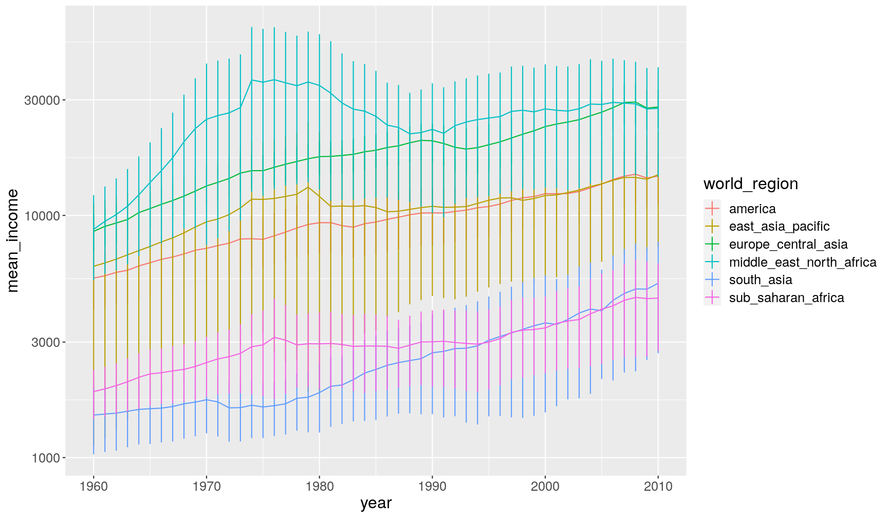
And here we graph the mean and its standard error (= standard deviation divided by the square-root of the number of observations). We multiply the SEM by 2, which gives an rough 95% confidence interval (with some assumptions…):
income_summary %>%
  # calculate standard error
  mutate(se_income = sd_income/sqrt(n_income)) %>%
  # make the graph
  ggplot(aes(year, mean_income, colour = world_region)) +
  geom_line() +
  # this adds the error bars
  geom_linerange(aes(ymin = mean_income - 2*se_income, ymax = mean_income + 2*se_income)) +
  scale_y_continuous(trans = "log10")
Quickly count observations per group
As we saw, the group_by() + summarise(n()) functions can be used together
to count the number of observations in groups of your data.
However, this operation is so common, that there is a function just dedicated for
counting the unique values of one of more variables.
For example, how many observations do we have for each combination of year and world region:
gapminder1960to2010 %>%
  count(year, world_region)
# A tibble: 306 x 3
    year world_region                 n
   <dbl> <chr>                    <int>
 1  1960 america                     35
 2  1960 east_asia_pacific           30
 3  1960 europe_central_asia         52
 4  1960 middle_east_north_africa    20
 5  1960 south_asia                   8
 6  1960 sub_saharan_africa          48
 7  1961 america                     35
 8  1961 east_asia_pacific           30
 9  1961 europe_central_asia         52
10  1961 middle_east_north_africa    20
# … with 296 more rows
This is essentially equivalent (but more compact) to:
gapminder1960to2010 %>%
  group_by(year, world_region) %>%
  summarise(n = n())
Grouped filter()
The group_by() function can be combined with other functions besides summarise().
Let’s say we wanted to get the rows of our table where the income was the lowest
for that year. For getting rows based on a condition we use filter().
Here is an example:
gapminder1960to2010 %>%
  group_by(year) %>%
  filter(income_per_person == min(income_per_person, na.rm = TRUE))
# A tibble: 52 x 13
# Groups:   year [51]
   country world_region  year children_per_wo… life_expectancy income_per_pers…
   <chr>   <chr>        <dbl>            <dbl>           <dbl>            <dbl>
 1 Congo,… sub_saharan…  2000             6.96            53.8              573
 2 Congo,… sub_saharan…  2001             6.91            54.1              545
 3 Congo,… sub_saharan…  2002             6.86            54.2              545
 4 Congo,… sub_saharan…  2003             6.81            54.6              558
 5 Congo,… sub_saharan…  2004             6.76            55.3              577
 6 Congo,… sub_saharan…  2005             6.71            55.9              594
 7 Congo,… sub_saharan…  2006             6.66            56.3              605
 8 Cambod… east_asia_p…  1972             6.18            45.4              565
 9 Liberia sub_saharan…  1996             6.11            48.9              413
10 Mozamb… sub_saharan…  1960             6.95            41.4              404
# … with 42 more rows, and 7 more variables: is_oecd <lgl>,
#   income_groups <chr>, population <dbl>, main_religion <chr>,
#   child_mortality <dbl>, life_expectancy_female <chr>,
#   life_expectancy_male <dbl>
Grouped mutate()
Let’s say we wanted to calculate the population of each country as a percentage of the
total population (across all countries) for each year. In other words, we want to
add a new column to our table, which is a job for mutate().
Here’s the example:
gapminder1960to2010 %>%
  group_by(year) %>%
  mutate(population_pct = population/sum(population, na.rm = TRUE)*100) %>%
  # select a few columns for readability purpose only
  select(country, year, population, population_pct)
# A tibble: 9,843 x 4
# Groups:   year [51]
   country      year population population_pct
   <chr>       <dbl>      <dbl>          <dbl>
 1 Afghanistan  1960    8996967          0.298
 2 Afghanistan  1961    9169406          0.298
 3 Afghanistan  1962    9351442          0.299
 4 Afghanistan  1963    9543200          0.299
 5 Afghanistan  1964    9744772          0.300
 6 Afghanistan  1965    9956318          0.300
 7 Afghanistan  1966   10174840          0.301
 8 Afghanistan  1967   10399936          0.301
 9 Afghanistan  1968   10637064          0.301
10 Afghanistan  1969   10893772          0.302
# … with 9,833 more rows
And, as usual, we could have piped this to a graph (try running it):
gapminder1960to2010 %>%
  group_by(year) %>%
  mutate(population_pct = population/sum(population, na.rm = TRUE)*100) %>%
  # make a graph
  ggplot(aes(year, population_pct)) +
  geom_line(aes(group = country))
Exercise
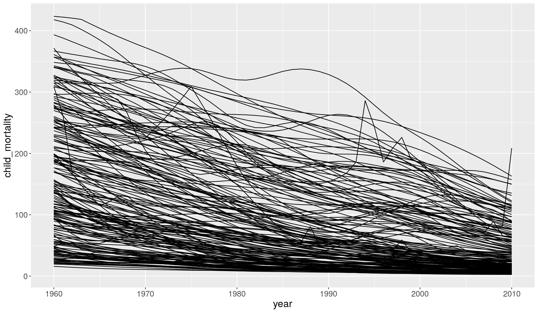
The following graph shows the change in child mortality over the years:
gapminder1960to2010 %>%
  filter(!is.na(child_mortality)) %>%
  ggplot(aes(x = year, y = child_mortality)) +
  geom_line(aes(group = country))
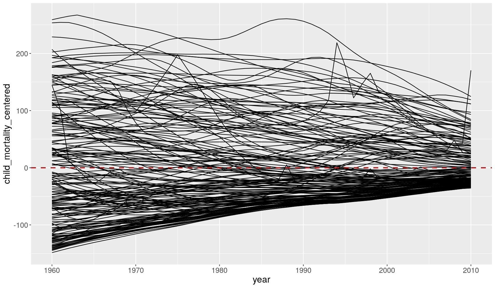
Fix the code below, to graph the change in child mortality centered on the mean of each year (i.e. subtracting each child_mortality value from its mean value):
gapminder1960to2010 %>%
  filter(!is.na(child_mortality)) %>%
  group_by(FIXME) %>%
  mutate(child_mortality_centered = FIXME) %>%
  ggplot(aes(x = year, y = child_mortality_centered)) +
  geom_line(aes(group = country)) +
  # adds an horizontal line
  geom_hline(yintercept = 0, colour = "firebrick", size = 1)
Answer
Here is the fixed code:
gapminder1960to2010 %>%
  filter(!is.na(child_mortality)) %>%
  # group by year
  group_by(year) %>%
  # subtract the mean from each value of child mortality
  mutate(child_mortality_centered = child_mortality - mean(child_mortality)) %>%
  ggplot(aes(x = year, y = child_mortality_centered)) +
  geom_line(aes(group = country)) +
  # add an horizontal line at zero
  geom_hline(yintercept = 0, colour = "firebrick", size = 1, linetype = "dashed")
This graph shows a different perspective of the data, which is now centered around the mean of each year (highlighted by the horizontal line at zero). While in 1960 countries were very variable, with some countries well below the mean and others well above it, in 2010 the coutries are all much more tightly distributed around the mean. The world is “converging” towards the same average value.
Remove groups with ungroup()
Whenever one does a grouping operation, it’s always a good practice to remove the groups afterwards, otherwise we may unintentonally be doing operations within groups later on.
Take this example, where we calculate the total income of each world region and year (and save it in a new object):
total_incomes <- gapminder1960to2010 %>%
  group_by(world_region, year) %>%
  summarise(total_income = sum(income_per_person))
`summarise()` regrouping output by 'world_region' (override with `.groups` argument)
total_incomes
# A tibble: 306 x 3
# Groups:   world_region [6]
   world_region  year total_income
   <chr>        <dbl>        <dbl>
 1 america       1960       192879
 2 america       1961       197252
 3 america       1962       203730
 4 america       1963       207844
 5 america       1964       216469
 6 america       1965       223334
 7 america       1966       230608
 8 america       1967       235679
 9 america       1968       242752
10 america       1969       251373
# … with 296 more rows
As you see in the output, the grouping by world_region was retained (by default summarise()
drops the last grouping variable). Now, let’s say that I wanted to transform
the total_income variable to a percentage of the total.
I can use mutate() to update my table:
total_incomes <- total_incomes %>%
  mutate(total_income_pct = total_income/sum(total_income)*100)
So, I should expect that total_income_pct adds up to 100%:
sum(total_incomes$total_income_pct)
[1] 600
But it adds up to 600% instead! Why? Because the table was still grouped by world_region,
the percentages were calculated per world region. And there’s 6 of them, therefore my
percentages in this case add up to 100% within each world region, or 600% in total.
The way to resolve this is to ensure we remove any groups from our table, which we
can do with ungroup(). Here’s the full string of commands, with the ungrouping
step added:
total_incomes <- gapminder1960to2010 %>%
  group_by(world_region, year) %>%
  # this calculates total income per world_region and year
  summarise(total_income = sum(income_per_person)) %>%
  # this removes any leftover groups
  ungroup() %>%
  # now we calculate the total income as a percentage
  mutate(total_income_pct = total_income/sum(total_income)*100)
`summarise()` regrouping output by 'world_region' (override with `.groups` argument)
And we can check our percentages now add up to 100%:
sum(total_incomes$total_income_pct)
[1] 100
Data Tip: Standardising Variables
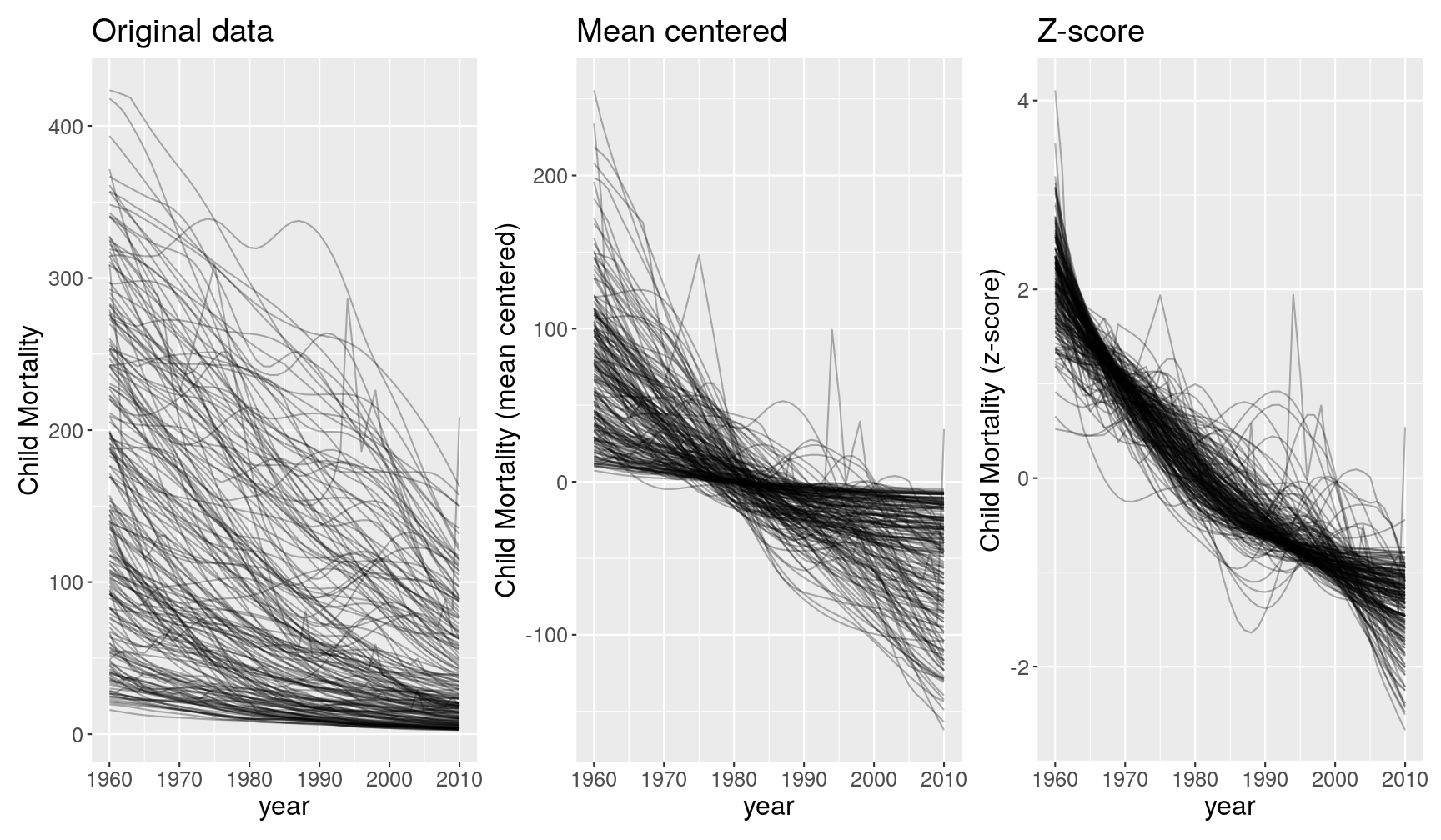
Often it’s useful to standardise your variables, so that they are on a scale that can be interpreted and/or compared more easily. Here are some common ways to standardise data:
- Percentage (or fraction). This has no units.
- Mean-centering (each value minus the mean of the group). This has the same units as the original variable. It’s interpreted as the deviation of that observation from the group’s mean.
- Standard score (Z-score). This has no units. It can be interpreted as the number of standard deviations away from the mean.
Take the following graphs as an example:
These 3 graphs show different perspectives of the data:
- The first graph tells us how many children die in each country across years.
- The second graph tells us how many children die in each country as a deviation from the country’s mean (e.g. 200 children above the mean or -100 children below the mean).
- The third graph tells us how many children die in each country on a scale that is relative to the variation in that country (e.g. 2 standard deviations above the mean and -2 standard deviations below the mean).
Which view of the data one chooses, depends on the underlying questions, and it’s up for the analyst to decide. In this case, if what I’m interested in is how many children still die across the world, then I’d choose the graph on the left. But if I’m interested in understanding how countries compare in their relative efforts to reduce child mortality, then the 3rd graph migth be more adequate.
(optional) Advanced Examples
This section briefly demonstrates slightly more advanced examples of using grouped operations, mixed with visualisation. The explanations are brief, but can hopefully demonstrate the range of questions that we can ask from our data.
- The
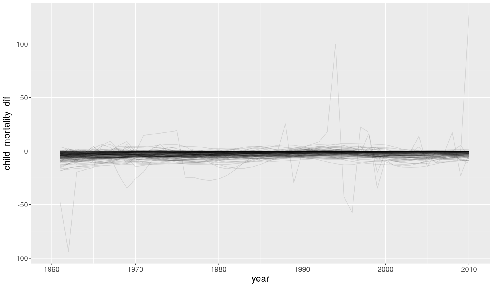
lead()andlag()functions shift vectors by one value, so that we can use them for example to compare values ahead or behind the current value. The following example calculates the change in child mortality between the current year and the previous one.
gapminder1960to2010 %>%
  # for each country
  group_by(country) %>%
  # order the table by year
  arrange(year) %>%
  # calculate difference between current and "lagged" child_mortality
  mutate(child_mortality_dif = child_mortality - lag(child_mortality)) %>%
  # plot
  ggplot(aes(year, child_mortality_dif)) +
  geom_line(aes(group = country), alpha = 0.1) +
  geom_hline(yintercept = 0, colour = "brown")
Warning: Removed 193 row(s) containing missing values (geom_path).
- The
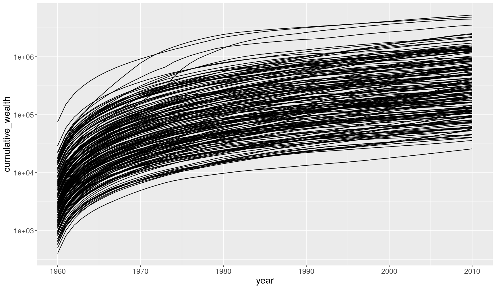
cumsum()function can be used to calculate cumulative sums (see more cumulative functions in dplyr’s cheat sheet)
gapminder1960to2010 %>%
  # remove missing values
  filter(!is.na(income_per_person)) %>%
  # for each country
  group_by(country) %>%
  # order by year
  arrange(year) %>%
  # calculate cumulative income_per_person
  mutate(cumulative_wealth = cumsum(income_per_person)) %>%
  # plot
  ggplot(aes(year, cumulative_wealth)) +
  geom_line(aes(group = country)) +
  scale_y_continuous(trans = "log10")
- We can use conditional vector subsetting (with
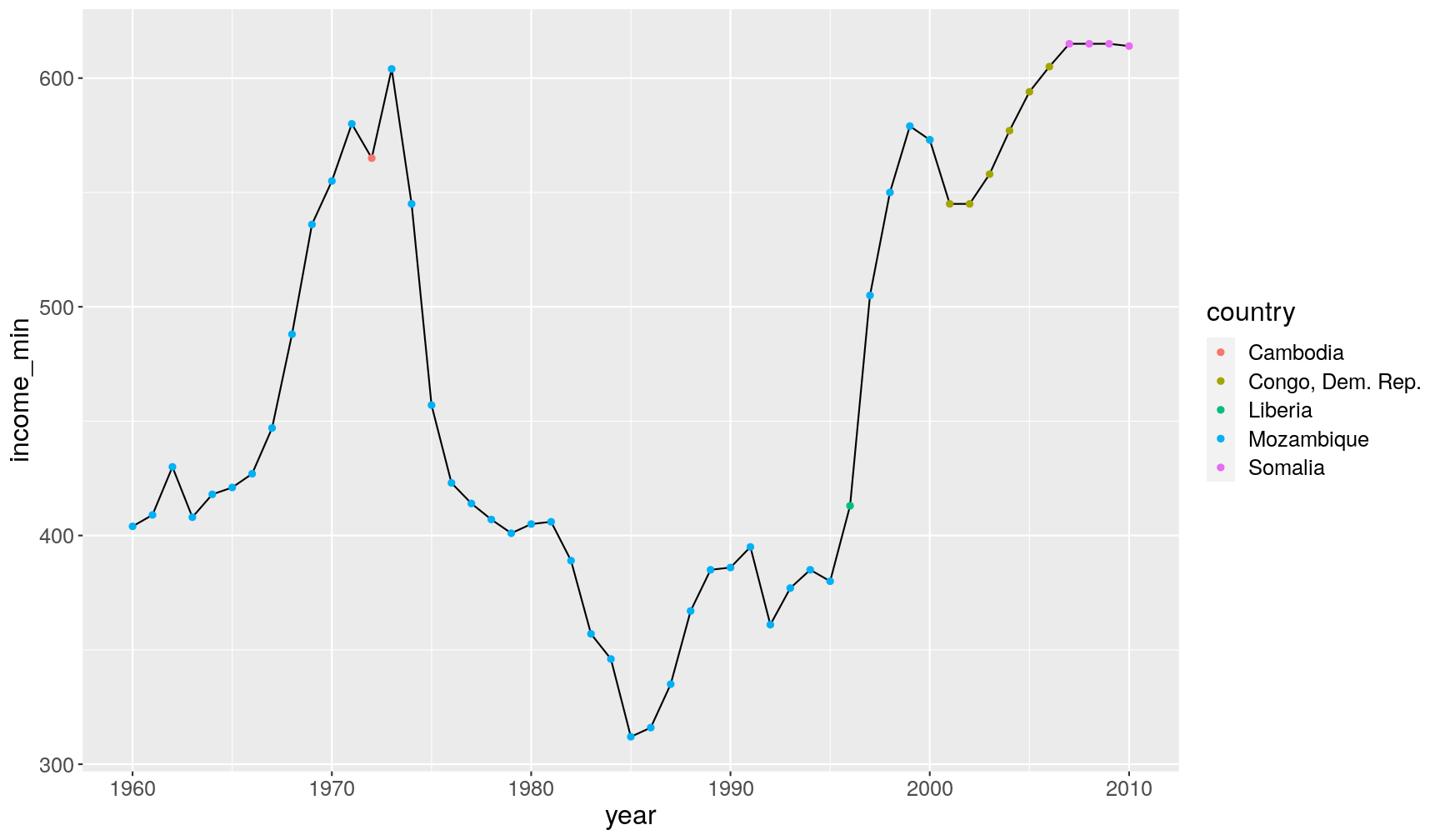
[]) inside these functions. In this example, we find thecountrywhere theincome_per_personis lowest, per year.
gapminder1960to2010 %>%
  # remove missing values
  filter(!is.na(income_per_person)) %>%
  # for each year
  group_by(year) %>%
  # calculate the minimum income and the country where income is equal to the minimum
  summarise(income_min = min(income_per_person),
            country = country[income_per_person == min(income_per_person)]) %>%
  # visualise
  ggplot(aes(year, income_min)) +
  geom_line() +
  geom_point(aes(colour = country))
`summarise()` regrouping output by 'year' (override with `.groups` argument)
Key Points
Use
summarise()to calculate summary statistics in your data (e.g. mean, median, maximum, minimum, quantiles, etc.).Chain together
group_by() %>% summarise()to calculate those summaries across groups in the data (e.g. countries, years, world regions).Chain together
group_by() %>% mutate()orgroup_by() %>% filter()to apply these functions based on groups in the data.As a safety measure, always remember to
ungroup()tables after usinggroup_by()operations.
